The ‘GoT’ Designers Just Broke Down Every Detail in the New Title Sequence
April 15, 2019Game of Thrones is back, and what a goddamn way to kick off the final season. Sunday night's episode has already been dubbed the best season premiere since the pilot, packing in a herculean amount of reunions and revelations into its comparatively short runtime: Jon and Arya back together again! Jon riding a goddamn dragon! Jon learning that he is both the rightful heir to the throne and has been banging his aunt this whole time! It was, uh, a big night for Jon Snow.
But the premiere also included one major twist even before the episode properly began: The opening credits were brand new. Sure, previous seasons made tiny changes to the titles, but those were just small tweaks like new locations or smoke at Winterfell or whatever. This was a full-on overhaul.
There's plenty in there to pore over and obsessively try to wring meaning from, but thankfully, the designers at Elastic—the company behind the now-iconic GoT titles—have decided to spare us all some much-needed time and sanity by breaking down every major change in the new credits sequence so we don't have to, Vulture reports.
“Around June of 2017, [series creators] Dan and David and [GoT producer] Greg came by and said, 'We want to change everything. Brand new. Let’s do it all over again,'" Elastic designer Kirk Shintani said in a new interview. "The biggest thing for them was to start at the Wall."
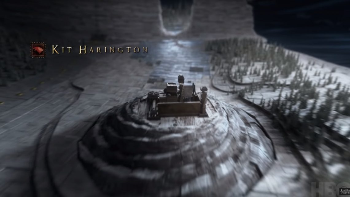
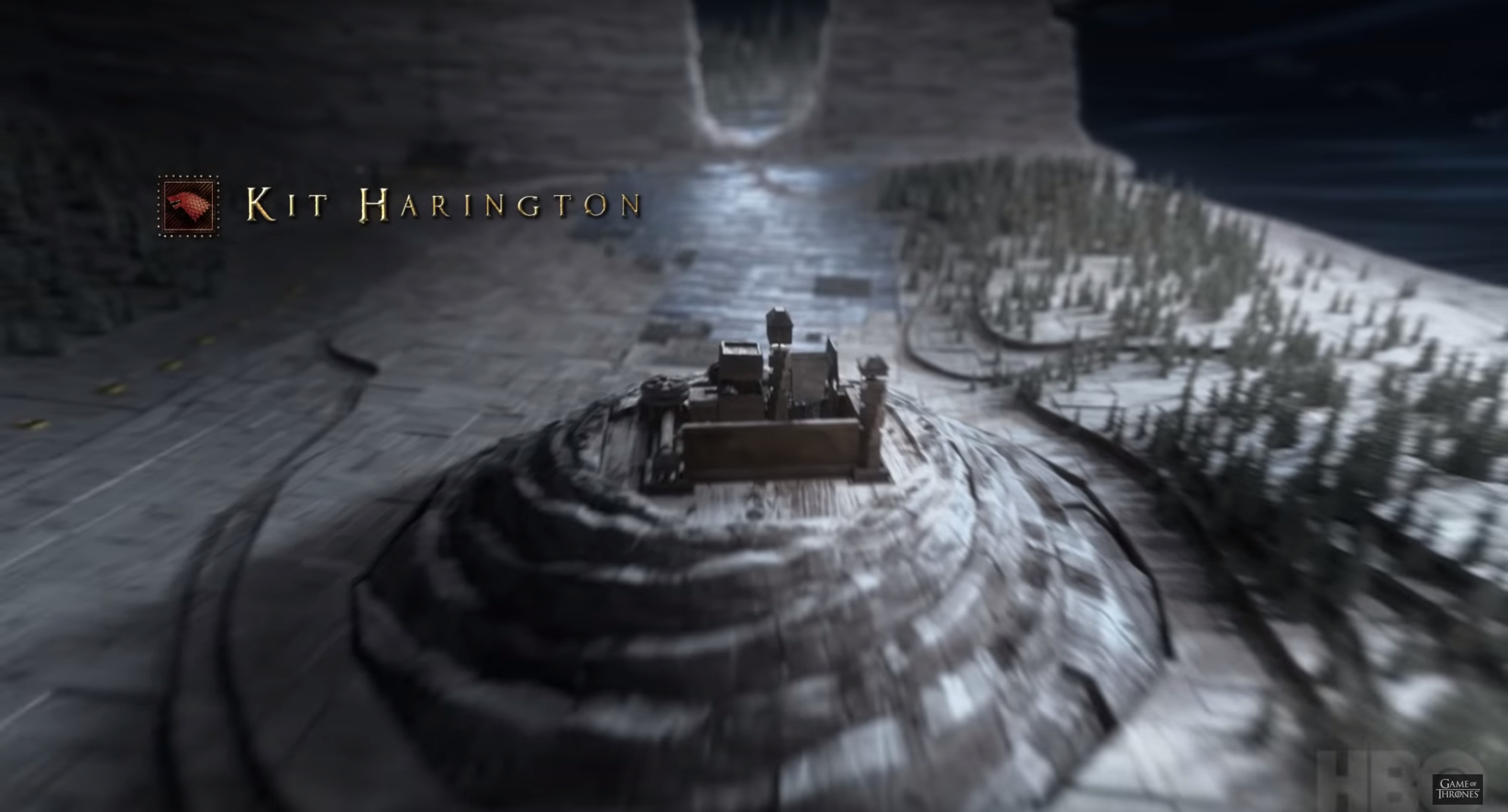
That's where the new titles begin, right at the broken Wall as it spills blue tiles into Westeros. "There are tiles on the ground that flip from white to black, snow to ice," another designer, the aptly-named Angus Wall, said during a separate interview with IndieWire. "That’s representing the White Walkers’ march south through the rift in the Wall. And that was something that we’d actually talked about, that idea of the tiles flipping and revealing things, in the very initial design discussions of the title sequence. It happens now to actually be a more interactive map and not just a geography lesson."
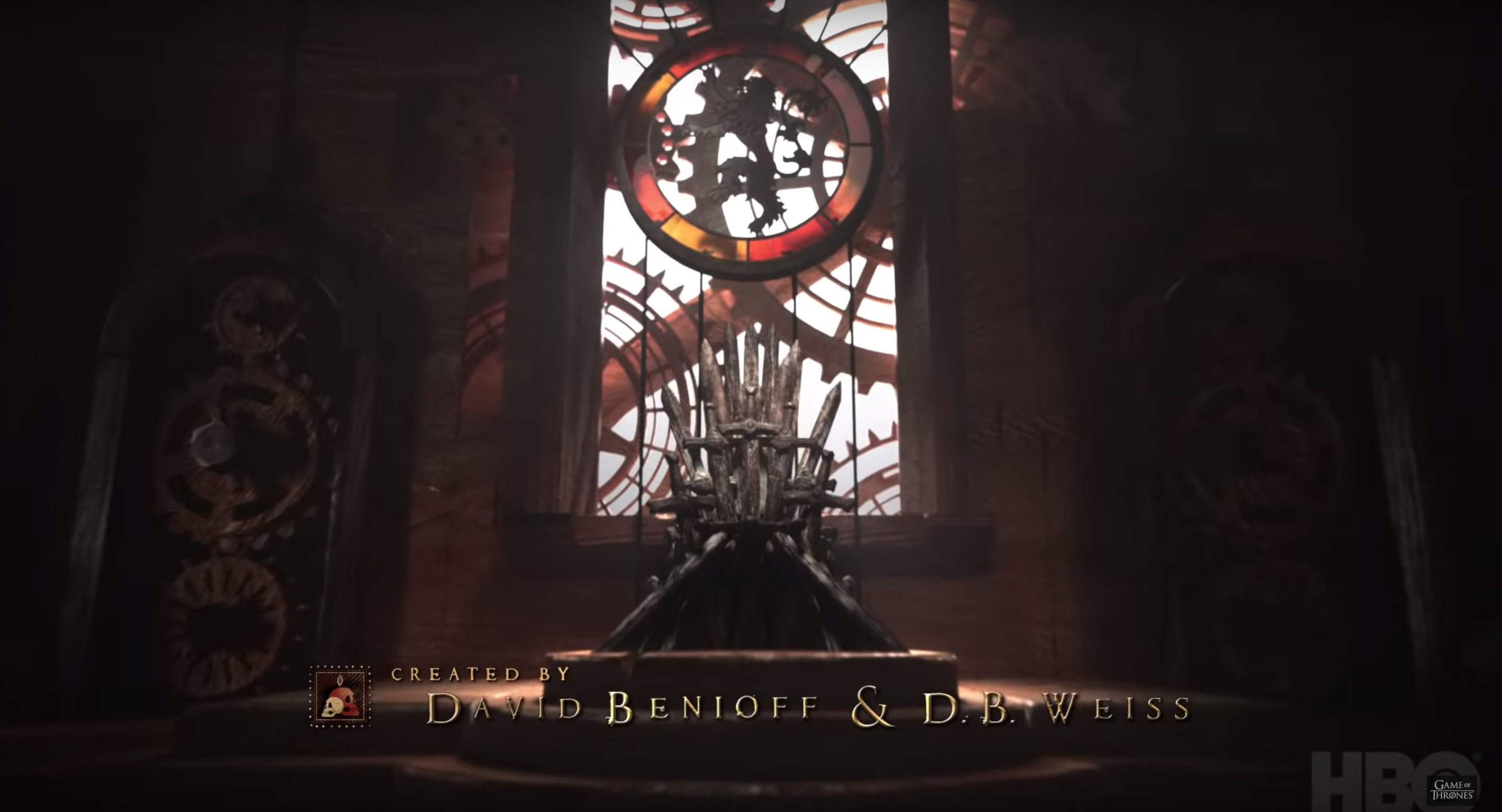
From there, the camera zooms south, before ending on King's Landing and going somewhere that we've never seen in titles before—inside the Red Keep itself. "The show has been inexorably moving towards the Iron Throne," Wall told Vulture. “Being able to go inside allowed us to actually end the title sequence at the throne."
To allow for actually going inside locations, the Elastic crew had to reconfigure scale of the map itself. In the previous titles, the various building sizes were all a little wonky. These new buildings are perfectly scaled, using a man who is "probably Jaime Lannister" for size reference, Wall said, per IndieWire. "The world has been rebuilt from scratch from the ground up, and that’s something that all the artists that have worked on it really wanted to do. They applied a very strict sense of scale in the structures, so all the textures, the wood grain is all to scale."
The last major change in the new title sequence is the astrolabe at the title's beginning. In the earlier seasons, the images etched on the astrolabe's bands reportedly depicted ancient Westeros history. Now, there are three new bands, showing off scenes from earlier seasons, from Ned Stark's beheading to Viserion and the Night King blasting through the Wall.
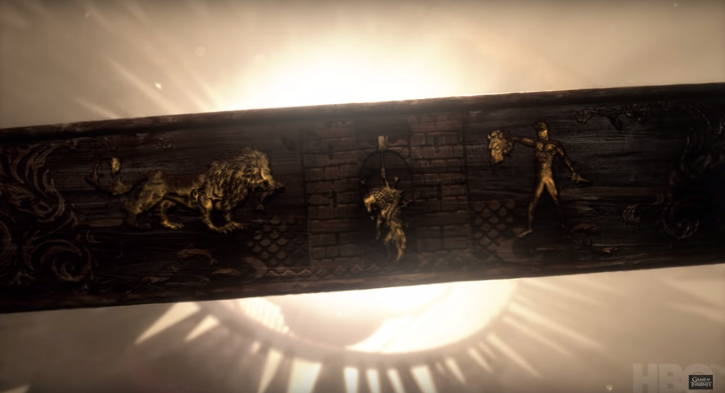
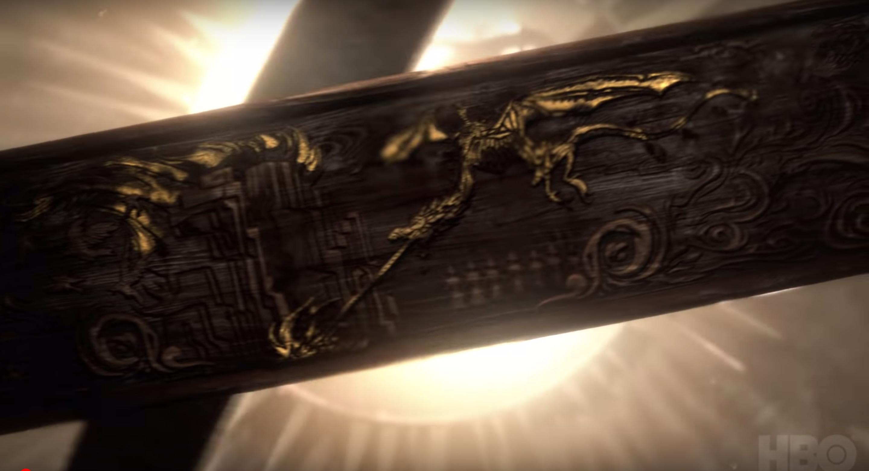
Those are the major Easter eggs tucked in the new titles, but for those of us still desperate for something to dissect, worry not—every title sequence this season will apparently be a little different, with their own brand-new secrets to find. "I’ll say that there are differences in every single episode," Shintani told BuzzFeed in a separate interview. "From episode to episode, pay attention, because there’s lots of hints scattered around." Get ready to waste a lot of time trying to decipher blurry screengrabs of the astrolabe for the next month and a half, everybody!
Sign up for our newsletter to get the best of VICE delivered to your inbox daily.


