Temperature Correlation Scale Over Time and Distance
August 20, 2018
What makes global temperature anomalies plots and maps go is the correlation of temperatures over a large area. This also is key to homogenization of individual station data when something like position or time of day when measurements are made changes. ATTP has a discussion going along these lines and perhaps Eli, as a long time observer, can add a bit of history and even some new insights.
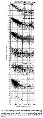
The first (as far as Eli and most of the Bunnies know) study to make use of this was the ur-GISSTemp work of Hansen and Lebedeff in 1987 which settled on a correlation distance of ~1000 km, but noting a variation with latitude shown to the left. The figure can be enlarged by clicking on it.
At middle and high latitudes the correlations approach unity as the station separation becomes small; the correlations fall below 0.5 at a station separation of about 1200 km, on the average. At low latitudes the mean correlation is only 0.5 at small station separation.that they ascribed to
The distance over which strong correlations are maintained at high latitudes probably reflects the dominance of mixing by large-scale eddies. At low latitudes the most active atmospheric dynamical scales are smaller, but apparently there are also substantial coherent temperature variations on very large scales (for example, due to the quasi-biennial oscillation, Southern Oscillation, and E1 Nifio phenomena), which account for the slight tendency toward positive correlations at large station separations.
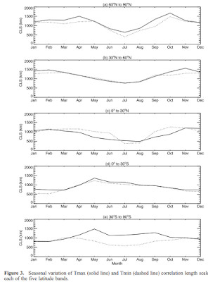
Casper, Alexander and Vose advanced the climateball in 2006, but to some, maybe only in Eli view not enough, notice, measuring how the correlation depended on season as well as latitude, clearly showing that the correlation distance decreases well below 1000 km during the summer and increases well above it in the winter.
While using a variable correlation distance would be hard to implement with a pad of paper and a comptometer for multiplication and division, it should be easy to do today with significantly greater computer power and better organized data bases to improve homogenization algorithms and temperature anomaly maps.
 Which brings Rabett Run to the next point, how many stations are needed. Sticking to his upbringing, Eli will ask needed for what? If all a lagomorph needs is a global temperature anomaly plot, the answer is not too many and one of the locals, Caerbannog, owns that franchise with his Wattsbuster, which he has been using on and off Twitter to slice dice and rice all use raw station data, use rural station data, use less station data, use more station data, use data from stations with left handed thermometer readers or right. bleats.
Here are 2 plots of global-avg temps I just computed from raw GHCN data (green curves) v. official NASA (red).— caerbannog666 (@caerbannog666) August 4, 2018
One of the plots contains results I computed after I deliberately rounded the station monthly-avg temps to the nearest 6C (10.8F).
Can you tell us which one it is? pic.twitter.com/5EJTPe9BuU
And like clockwork, what do we get? Another copy/pasted cherry-picked plot (of unknown origin).— caerbannog666 (@caerbannog666) July 4, 2018
Here's what you get when you process *all* urban & *all* rural stations. 2 plots below: 1 rural & 1 urban raw(green)+adj(blue) grid/avg vs NASA(red).
Which plot is rural? Urban? pic.twitter.com/Pa3saqhQCu
Here are results computed from 25 rural stations in the USA, Canada, Northern Europe, Australia, and New Zealand. Raw=green, adjusted=blue.— caerbannog666 (@caerbannog666) August 20, 2018
Top plot shows temps, bottom plot shows # reporting stations/year.
No "poorly maintained urban stations in Africa". pic.twitter.com/7QUPgbK7AY
You can even get a reasonable match to the various global temperature anomaly measurements with fewer, even less that 10, but what you can't get are maps of the anomalies. How many do you need for that.
While looking for the Casper, Alexander and Vose paper the existance of which Eli had dredged out of memory, Bunny came across Bridget Tobin's Master''s Thesis (advisor:Jerry North) which makes the point that
The autocorrelation length scale found in annual averaged observational surface temperature data is about 1500km (Hansen and Lebedeff, 1987; Kim and North, 1991). 1500km is the inherent length scale for long term averages in noise-forced energy balance models (North, 1982). It also happens to be the characteristic size for the synoptic scale features that are prominent on daily weather maps. This latter is probably due to the corresponding size of the Rossby radius of deformation (Hess, 1959). The climate (time averaged data) length scale is not solely determined by dynamical considerations but seems to be dependent on radiation damping as well.
It is interesting to see if this is a property exclusively of the surface temperature. If one takes disks of 1500 km radius and covers the earth, about 65 are required. This implies there are about 65 statistically independent regions on the earth with respect to low frequency surface temperature fluctuations (Hardin and Upson, 1993). If the correlation lengths are significantly larger in one season than in the other, it may be possible to use fewer than 65 statistically independent regions to cover the earth during that season. At the same time, the correlation areas seem to be largest in the more variable seasons. This coincidence suggests that a compensation occurs making the sampling errors seasonally invariant.
So the answer is 65 or so.


