This Artist Reimagined Pop Songs as Beautiful Infographics
July 5, 2018In 2015, artist Katrina McHugh decided to tackle the viral art challenge “100-Day Project” by making infographics of pop song lyrics. The results were delightfully cheeky riddles that turned lyrics everyone knew into beautiful works of art. But as McHugh began deconstructing pop songs, she noticed “recurring themes," as she wrote. "The wind. The moon. Rivers and valleys. Countless allusions to the world around us.” She decided to impose rules on her work, only creating pop song infographics that involved elements of nature—animals, leaves, rocks, space. She named the project “100 Days of Lyrical Natural Sciences,” and created 100 posters that fit these constraints. These posters became a kind of internet indie darling in 2016 after being featured in The Bold Italic, Brit & Co, and Instagram’s homepage.
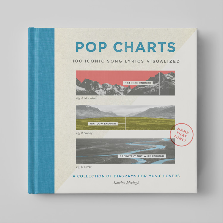
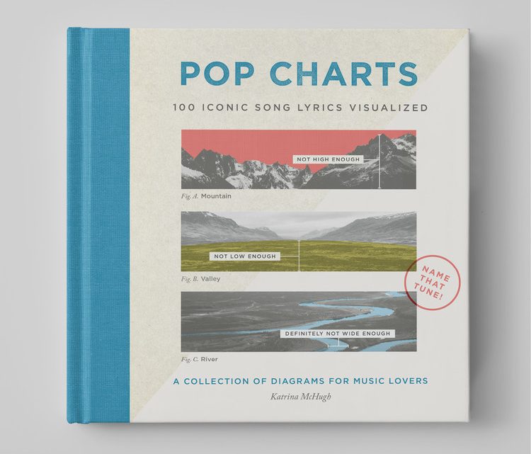
McHugh’s work has since been collected into the book Pop Charts: 100 Iconic Song Lyrics Visualized. It’s the perfect conversation piece—every single guest who has seen this book on my coffee table is inevitably drawn in, addicted to flipping through and guessing the song.
I talked to McHugh about her artistic inspirations and her favorite pop charts from her new book:

VICE: How did you come up with the project “100 Days of Lyrical Natural Sciences”? Do you typically work with nature images in your art?
Katrina McHugh: Before I committed to this project—I mean, it’s 100 days long, and I wanted to make sure I like it—I asked myself some different questions. What is it that you’re drawing mainly in your free time? And that was mostly nature. At the time I was working on a project about flowers and their meanings. I found a very old journal from my great-grandmother where she’d written it all out, like the meaning of a red versus a white rose. I love the idea of assigning emotions to natural elements. I had a whole encyclopedia from my grandpa, so I was also looking at those.
I then tried to think about what I most liked doing in the day—the best parts of my day. It tended to be when friends sent me new music to listen to. For me, that was where I decided to connect those dots together. Many of the songs I made into infographics, in the beginning, were from friends. I’d listen and think, “Maybe I can make a natural diagram out of this.” But eventually I had to start looking for nature in songs, which turned out to be harder than I’d think. There are whole genres of songs where they just sing about their feelings, and I’m there like, “Come on, there’s got to be natural element in here somewhere.”
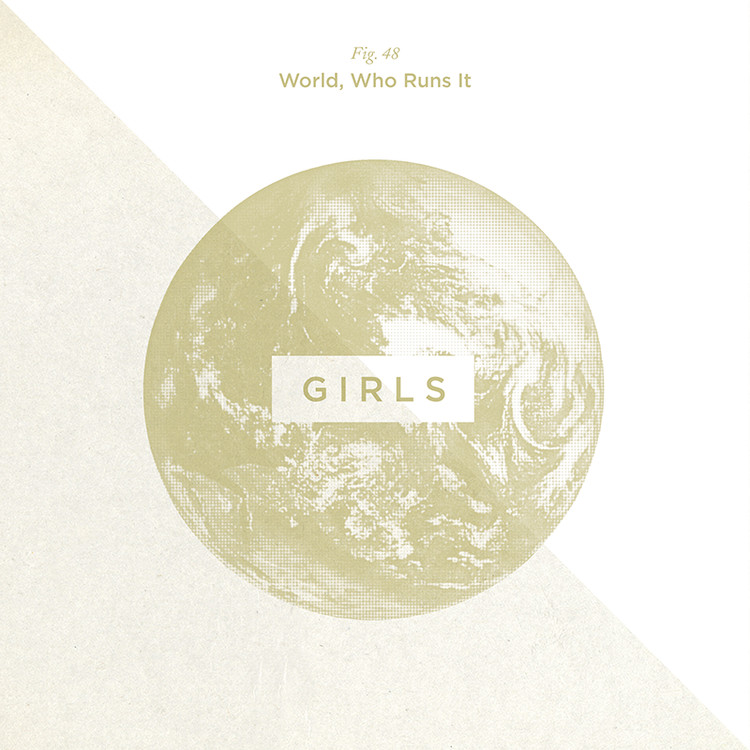
That was one of my favorite parts of this project. Most of these songs are ubiquitous, and I didn’t realize how many songs referenced some element of nature in them.
It makes sense—nature is unifying. Someone could have written a song 400 years ago and said, “She’s like the wind.” Or it could have been in the 80s. There’s a sense of connection.
How did the idea become the book?
Well, my posters were published in The Bold Italic. From there Brit & Co saw it and from there my work was featured in a #100dayproject collection on Instagram’s homepage. It got a lot of coverage in a short period of time. An agent approached me and asked if I wanted to pitch it. At the time, I was like, “Wait what?” I had done this for myself, just a personal project.
I might have approached it differently if I knew it was going to be made into a book, or something beyond my personal enjoyment. A lot of posters in the book are new. We got the book deal, but in the first round, a lot of artists were a lot smaller. And the publisher wanted them to be a bit more broad.
Your work clearly resonated with people.
It’s been cool to see which songs people were really into, and whether people really “got” the format. I thought it might be weird. One of my favorite things about this has been connecting with other humans. So many people will respond to a song over the internet, but actually getting to talk to someone about it is my favorite part. People have songs that are meaningful to them that I would have never guessed.
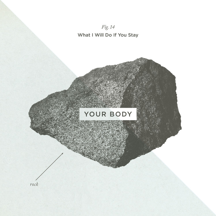
When I first started I had all this idea that I’d look for more natural metaphors, and more emotional connection. But sometimes I’d think to myself, “No, ‘Rock Your Body’ that’s what we’re doing today.” And it was just about a rock! In that sense, the graphic style changed a lot from poster to poster.

Have people picked favorites?
Probably TLC’s “Don’t Go Chasing Waterfalls.” I’m always surprised at people who are a lot younger who love that song. There are some songs I thought, “There are no way people are going to get this.” But I meet 17-year-olds who are into old oldies.
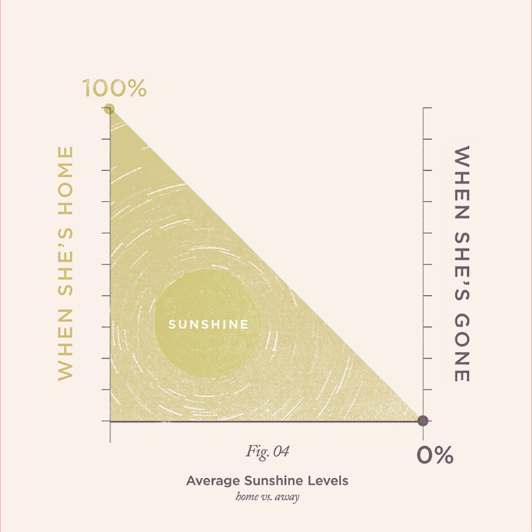
The images on my website are the ones people tend to like. “Ain’t No Sunshine When She’s Gone”—people really love that one. It’s simple and it also actually works as a infographic “graph,” which is really nice. That one happened near the beginning, when I thought they’d all be these informational style graphs. That... did not happen. They ended up being much more free-flowing and poetic sometimes.
Do you have a favorite?
I have a few favorites. The one I’m most proud of is probably “Strange Fruit,” especially since it made it into the book. That’s a really important song, and one I’m happy that’s in there. There’s also more lighthearted diagrams like Tom Petty’s “Wildflowers,” with just the label “where you belong.” It’s not very complex, and I tend to gravitate towards those ones to hang in my own home.

My friends and I were laughing about Snoop Dogg’s “Gin and Juice.”
I was kind of reaching for the natural element in that one I will admit.
We got that one immediately.
I was thinking about how Martha Stewart and Snoop Dogg are working on that cooking show recently. I so badly want them to have that poster, and to tell them, “I made this for you guys.” I want it on their wall.
Sign up for our newsletter to get the best of VICE delivered to your inbox daily.
Follow Nicole Clark on Twitter.

